

The re-design of SEOmoz has proven itself to be a very difficult and time consuming task, as you can see I'm still working on the header. Rand suggested I write a blog entry so you can all see how things are coming along and share in my turmoil. :)
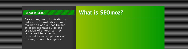
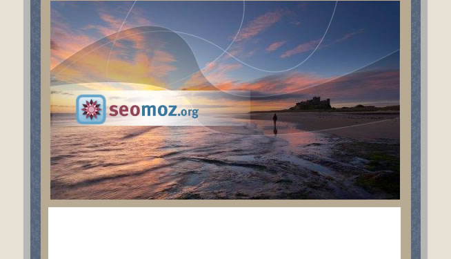
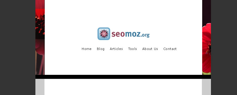
Some of the designs turned out okay, others are just plain horrible. I've found my best work comes by accident, so I often just tinker around until I start to like what I'm seeing rather than having some kind of plan and sticking to it. This tinker-until-you-get-it process often yields some pretty freaky stuff. I'm pretty sure none of these designs are going to make it into the site, but if I had to pick one it'd be one of the following three:


The rest of these aren't very good. I went for some pretty awful color schemes on some of them and you can definitely see I'm fond of gradients. The quest to make a web 2.0 site is difficult.
 |
 |
 |
 |
 |
 |
 |
 |
 |
 |
 |
 |
 |
 |
 |
 |
 |
 |
 |
The author's views are entirely their own (excluding the unlikely event of hypnosis) and may not always reflect the views of Moz.


Comments
Please keep your comments TAGFEE by following the community etiquette
Comments are closed. Got a burning question? Head to our Q&A section to start a new conversation.